Nisses Christmas Advent Calendar 2016
BY: Axel Gustafsson, Johan Hultman, Martin Lindberg, Nathalie Strindlund, Luisa Olofsson
BACKGROUND
This assignment was about creating a christmas calendar with 24 windows containing events that opens each day of December in a slideshow.
The user should also be able to open windows on all previous days including the current date.
All windows were to be stored in a backend array and the whole calendar, including the documentation, hosted on a Firebase website.
The task was to make all graphic content and write all the code ourselves to make our calendar look like we visualized it and work the way we wanted it to.
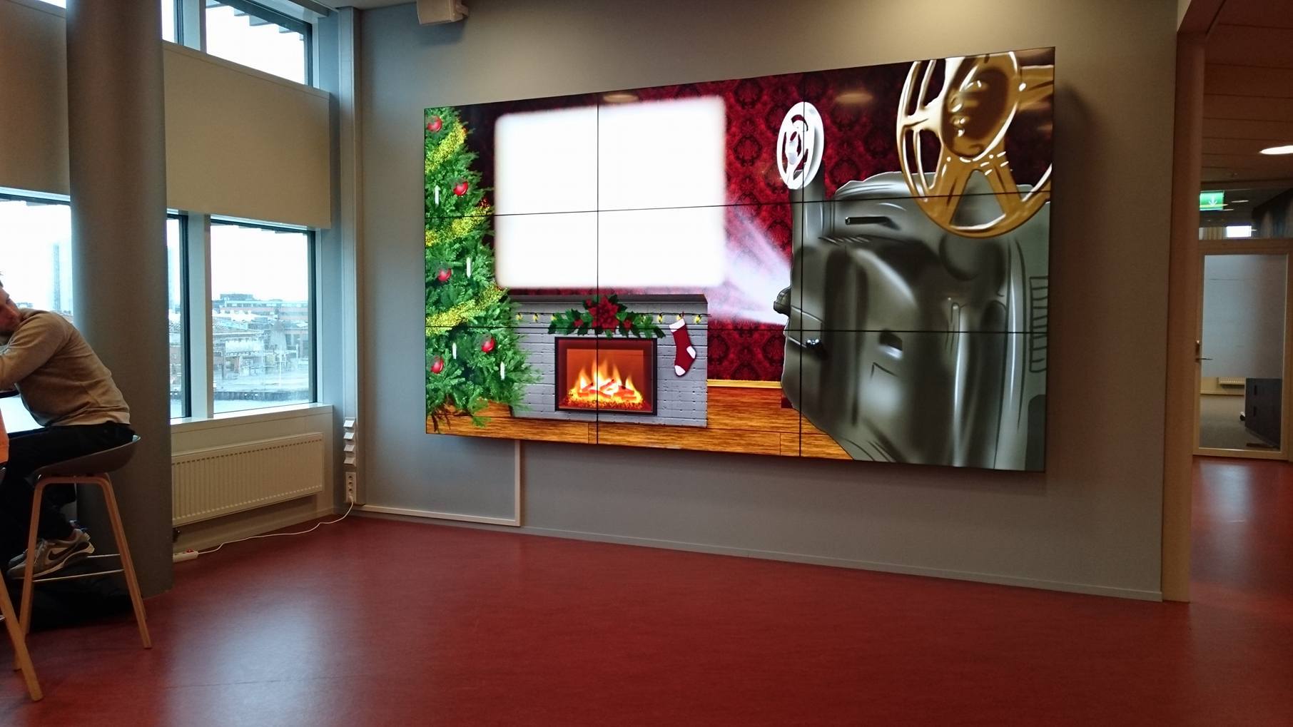
Our advent calendar was shown at MAH, during december 2016 on a public display in the Niagara building.
We were told that the calendar was going to be shown on two different screens at MAH, Niagara. The two screens were also different in size.
So this was something he had to take into account when designing our calendar.
OUR VISION
Instead of going with the classical calendar with displaying 24 different windows to open we went with a slideshow approach.
The reason behind this was that we wanted to do something different and tried to imitate that sociable and loving environment around Christmas.
We imagine you and your family cuddling up in a couch, looking at this slideshow while waiting for Santa to climb down the chimney and hand over the gifts.
We decided on it pretty quickly after a discussion within the group. The slideshow should tell a story. Some sort of comic-strip.
How to present the slideshow took a little bit longer to figure out. But after someone mentioned a "vintage"-theme, we thought about an old projector.
Everyone liked the idea so we devided the work into coding/graphical-work and got started. Pretty much right away.
UNDER WAY
So this was what we decided on; The calendar is a movie projector in a christmas setting.
Showing different pictures of "Nisse". Describing his days from 1st dec to 24th dec.
One new picture is added to the slideshow each day. So eg. on the 16th of december, a slideshow of 16 different pictures is shown.
Then on the 17th a slideshow of 17 pictures.
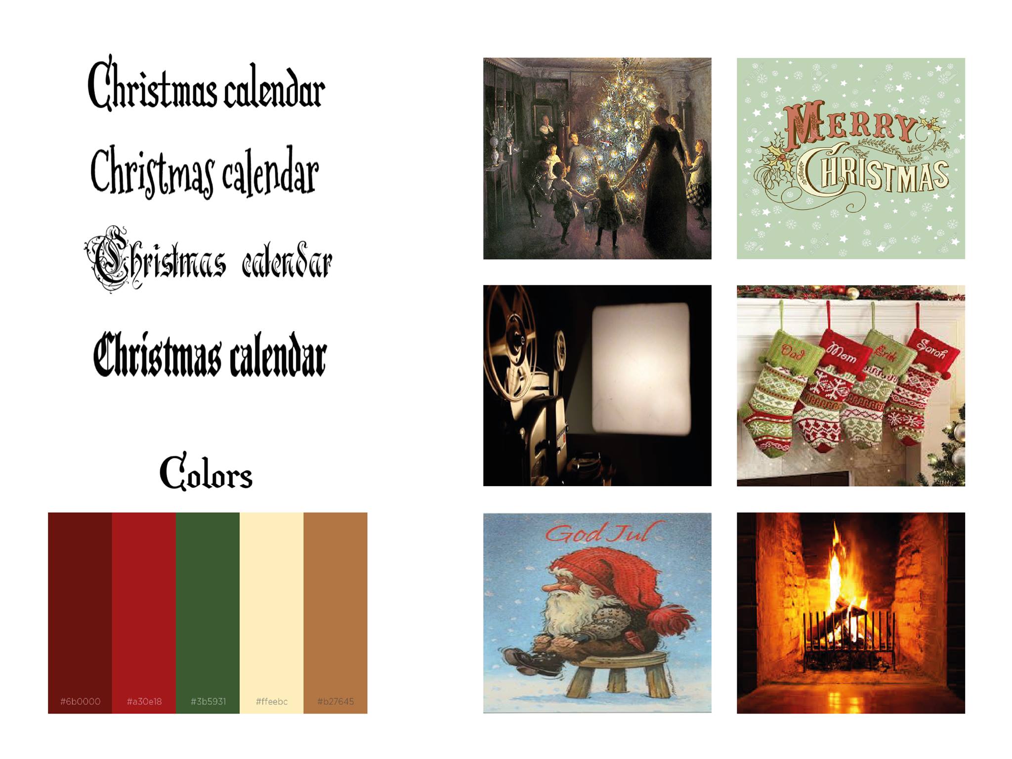
We started of by creating a moodboard to caputre the mood and feel of our calendar-to-be. As seen below:

Our moodboard. Cozy and "christmasy"
We wanted to make the calendar realistic and therefore we decided to set up a room looking like it could be the livingroom of someone celebrating Christmas some time ago.
Aside from the projector and projector screen we added a Christmas tree, a fireplace and some Christmas decoration with 3D-effects to make it look like an actual room setting.
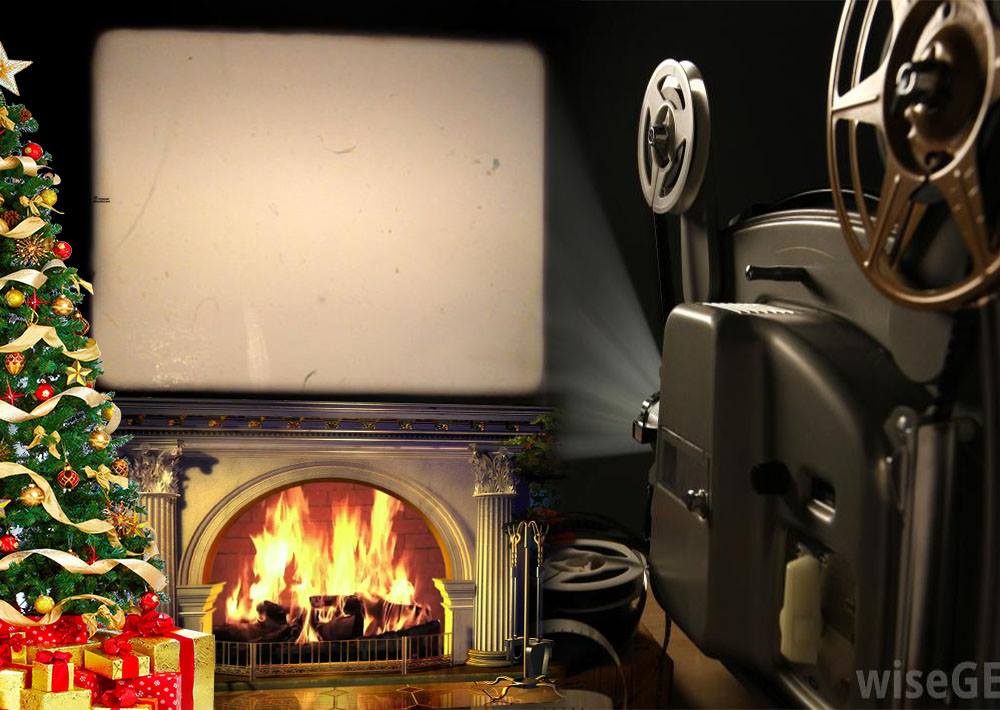
With these things in mind, a mock-up was created in photoshop. To help illustrate our setting/background image for our calendar.
And here you can see the mock-up:

Mock-up of our background image-to-be. A bit rough but it does its job.
To make the calendar feel vintage we added “old picture” filters to the slideshow images.
We really wanted to capture the cozy spirit of Christmas and therefore we made the atmosphere warm and comforting.
The classical Christmas colouring of the background is an important contributor to this. With the darker colours we chose you get the feeling that the whole scene takes place at night.
Even though there are no windows in the image you can really imagine a heavy snow cover outside. To increase this feeling we added the fireplace that we later animated.
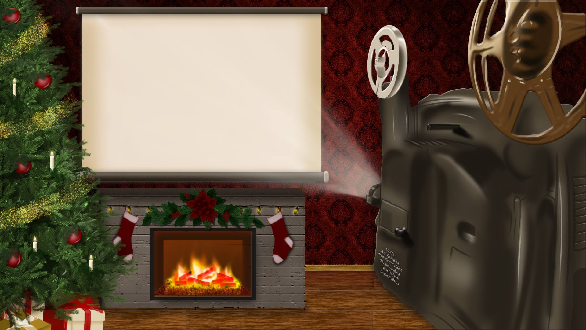
With the mock-up our background image was produced. On this, our 24 different pictures with "Nisse" will be displayed on the screen over the fireplace.
See below!

Very close to the final result. Click this image to open our latest version of the calendar.


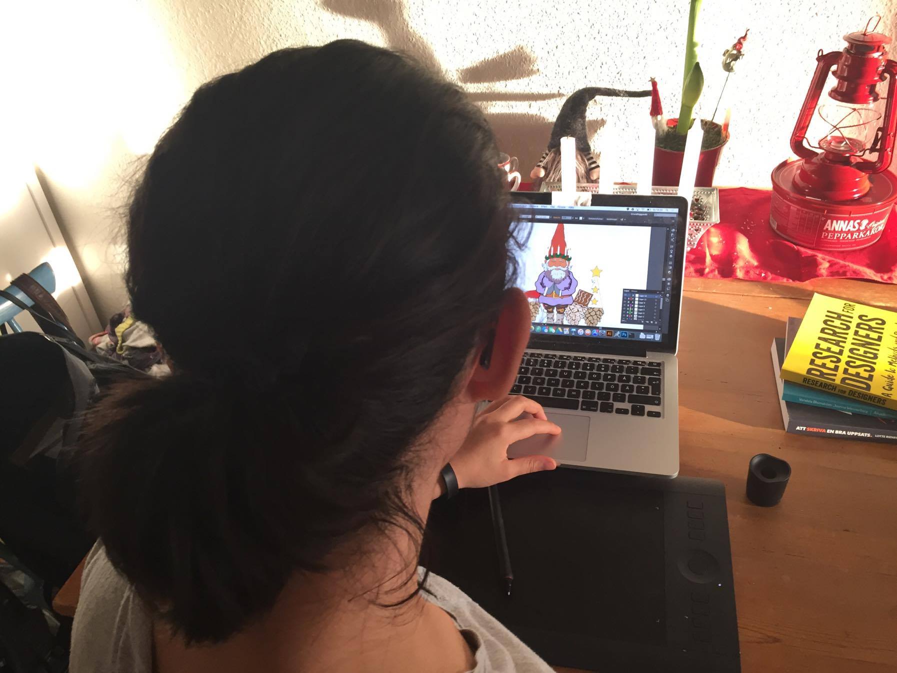
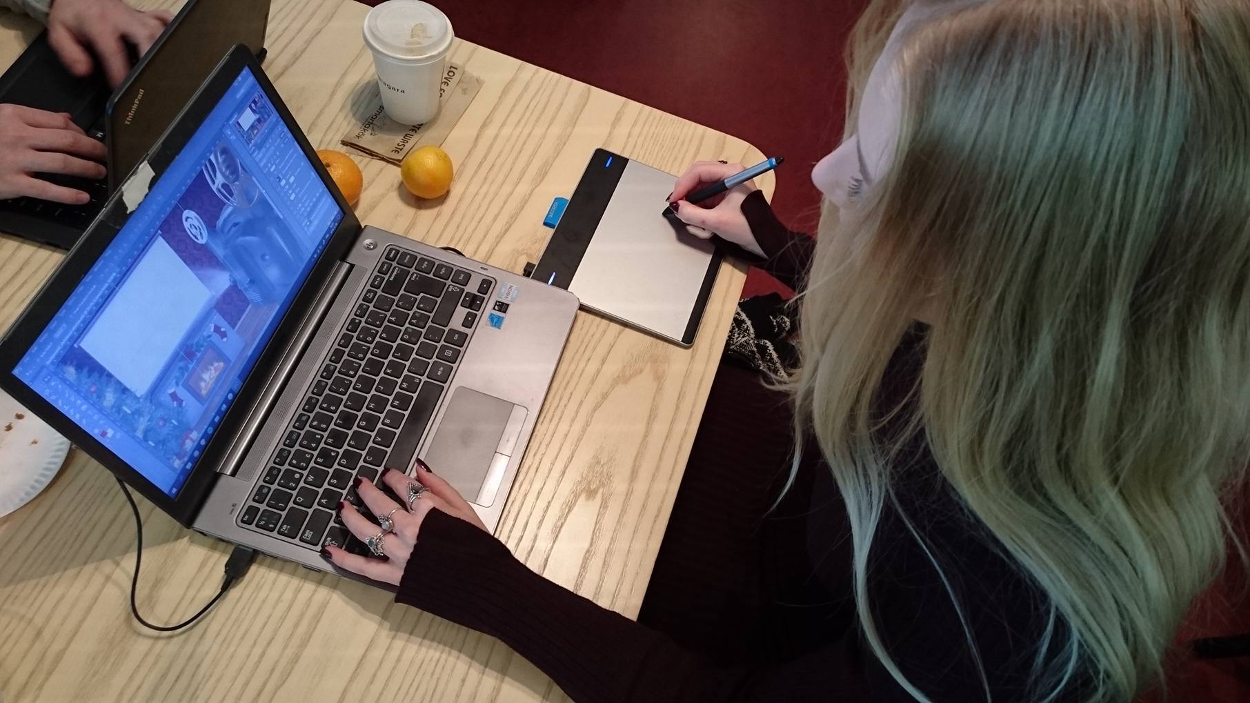
The team in work!
RESULTS
Pretty quickly, we got the background image, basic code, structure and animation "done". Now the biggest step was to create our 24 images of "Nisse".
Or so we thought.. the documentation would also prove to be a bit more time consuming than we first thought. But after some rewrites we came up with what you see here.
One challenge with the background animations that we faced were the weak raspberry-pi's. For our first calendar version with animation, the whole background consisted of one big .gif.
This made the calendar lag and didn't look good at all. We resolved this by simply cutting out the animation into a smaller .gif. Then placed that .gif on a static .png background image.
Our coding team (Martin and a little bit Axel) sometimes struggled with finding efficient solutions that also would have to work with existing code.
The two different sized screens were also somewhat of a challenge. From the start we had to code to make it fit on both. Solved by scaling all images by %-values.
In hindsight there isn't much that we would want to change. However there is more that we could further develop. Examples; Add sound for a greater experience, create a more cohersive and exciting story with Nisse.
One additional function would be a solution for "portrait"-mode screens (vertical screens). For the moment the calendar doesn't support portrait-mode.
These are things we had in mind from the start. But were moved out of focus to prioritise more fundamental aspects of the calendar. For example of these are; the 24 images and background animations.
Our final product is something we are very satisfied with. A calendar we can display with pride.
